This project was created while working in "named" company as such the copyright belongs to them.
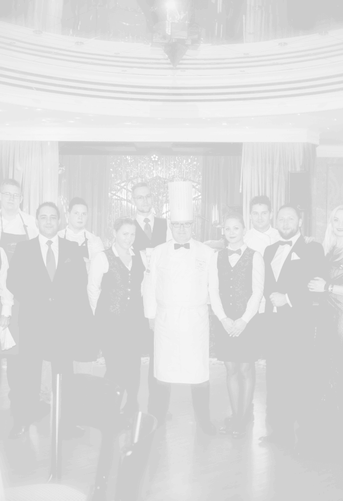
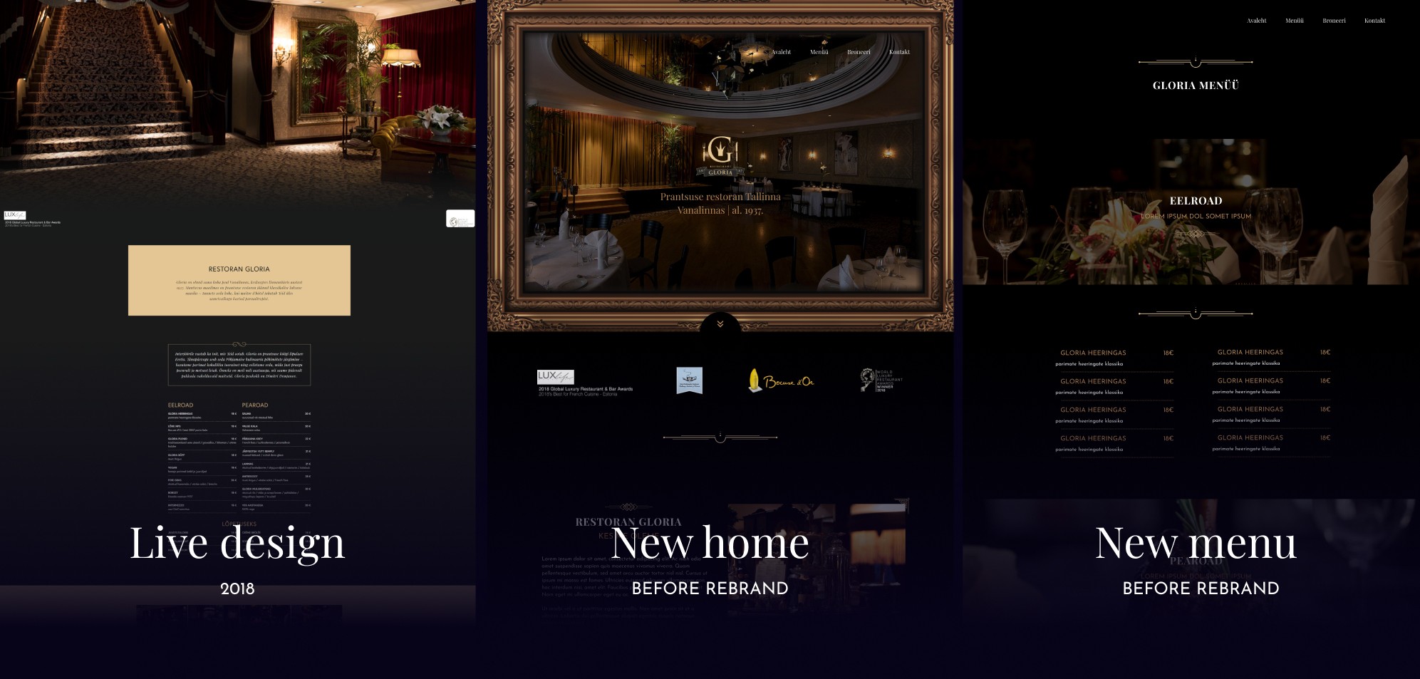
Restaurant gloria is located in the heart of Tallinn and has been sharing its hospitality for over 70 years. Behind the magical number there are hundreds of thousands of memorable taste experiences, happy moments and high guest visits which include but are not limited to prince Charles, Johannes Paul II, Rolling stones and Sting
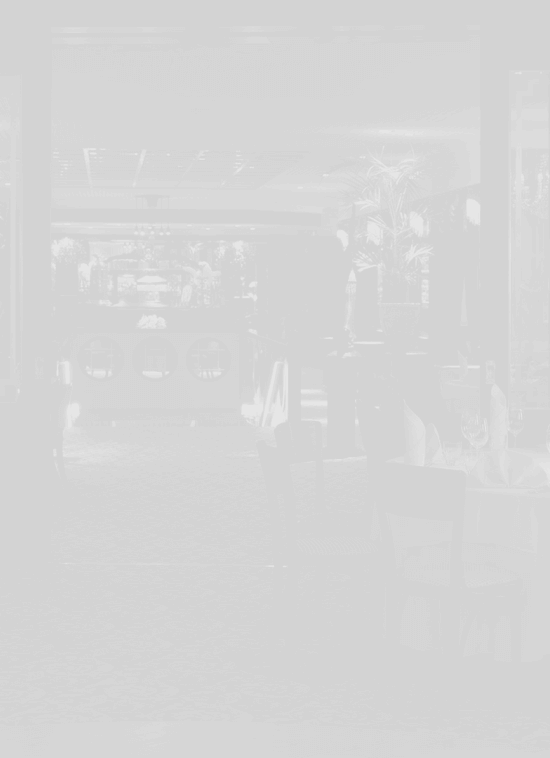
Gloria, based on the traditions of estonian and french cuisine introduces different food cultures and old european classic culinary.
Gloria, innovative in form and conservative in content, has always offered the best that it has found in natural Estonia and reflects our four seasons.
Challange
Gloria was a project initiated during my brief tenure at the "named" company. The client's previous website had aged for approximately a decade and was in dire need of a comprehensive redesign. The initial design concept for Gloria featured a color scheme predominantly characterized by dark black and brownish hues, complemented by rich, bright brown tones. However, midway through the project, the client recognized the necessity and potential for a complete rebranding effort, prompting the abandonment of the initial design.
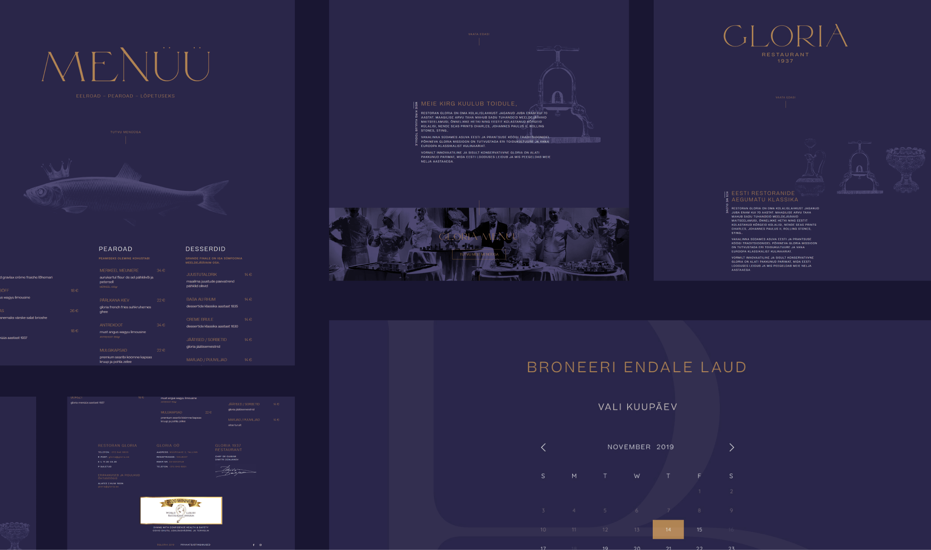
The new brand identity introduced a vibrant color palette, primarily consisting of purple and rich brown shades. This transformation imbued the brand with a significantly enhanced sense of opulence and sophistication.
While I was able to leverage some of the initial design concepts, a substantial portion of the project evolved into a distinct and innovative direction. I can confidently express my deep admiration for the newly established brand, as it resonates with me on a profound level.
Solution
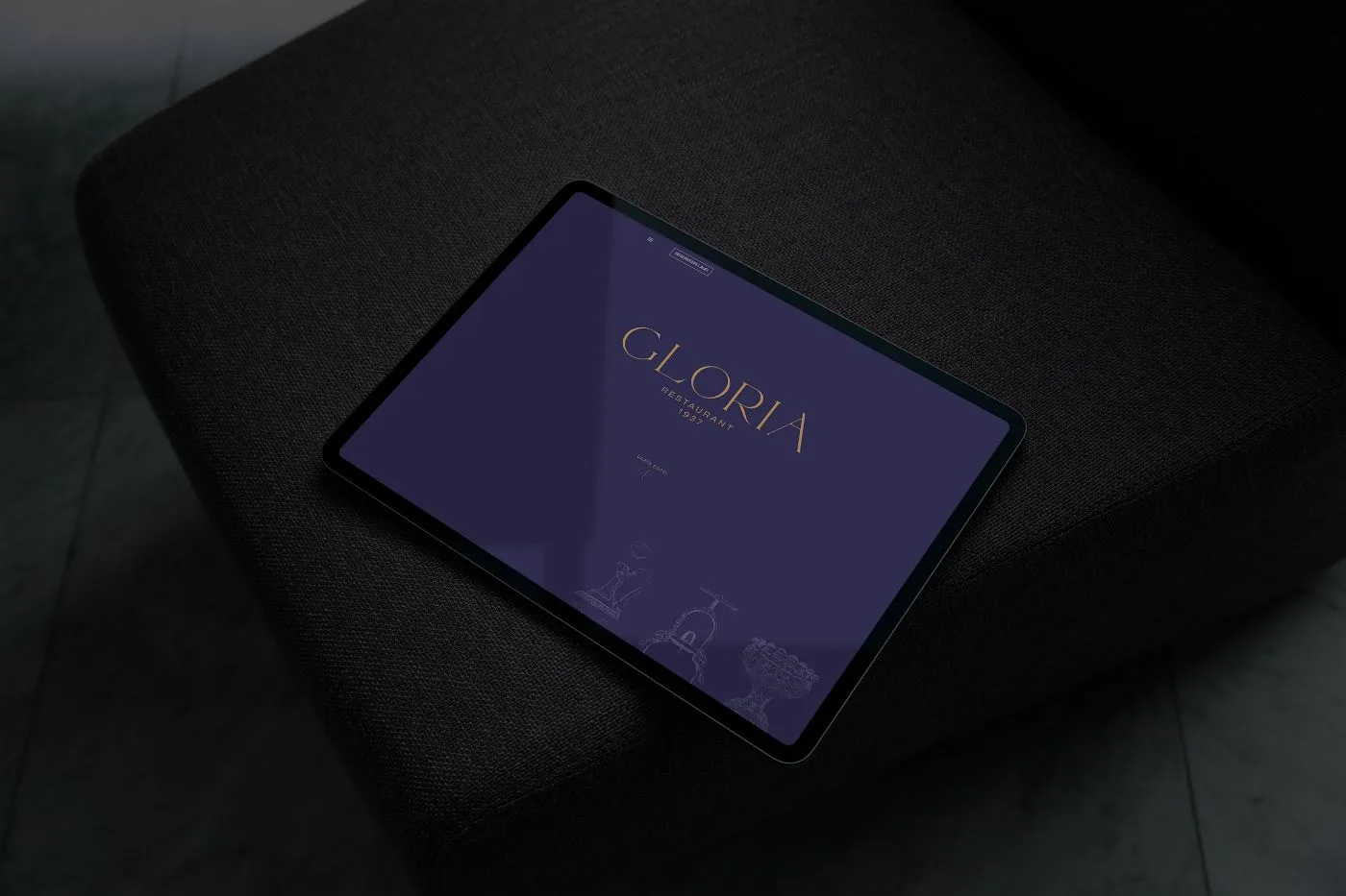
The new Gloria design came to life very fast. Armed with the brand guidelines, the vision for the website’s aesthetics became crystal clear. The prominence of large, bold, yet elegantly designed serif typefaces set against generous expanses of white space was the optimal choice for incorporating graphical elements. Little else was deemed necessary.
In the words of Gloria’s founder, the new site was intended to be concise, minimizing the need for extensive scrolling. Given that the primary focus was on driving bookings, it was decided that the menu would feature only two elements: a Burger menu for expanded options and a ‘Book a Table’ call-to-action.
The initial design, conceived during my tenure at the company, underwent a few iterations but remained faithful to the original look and feel I had envisioned.
I provide digital experience services to startups and small businesses. I help my clients succeed.